It goes without saying we’ve seen no shortage of history-making news this year, from the coronavirus pandemic to the ongoing US-China trade war to the highly contested US presidential election.
But a lower profile story snuck in under the radar this summer. And that story is? Well, brace yourselves: one of the world’s most prestigious investment banks, Goldman Sachs, has created its own font.
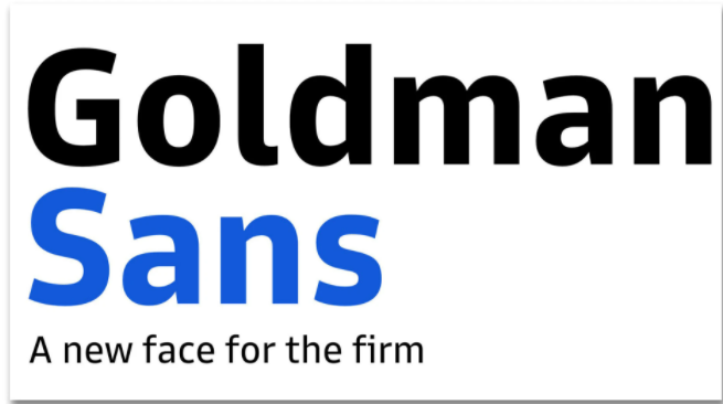
©Goldman Sachs
Yes, we know. Other companies have created fonts. And this certainly isn’t a life-changing event.
But in N/N’s little corner of the world – i.e. the world of financial services thought leadership consulting – this story matters. Goldman Sachs is a key player in many of the world’s largest transactions. And this move is their way of saying: We’ll not only own what we say in our corporate publishing; we’ll also own how we look saying it. The shape of our letters – the curve of the j, the height of the x – will also convey unique meaning.
Why is this significant?
Well, we spend a lot of time at N/N helping our clients develop their tone of voice. This task, truth be told, is the hardest. That’s because what makes one voice compelling and another insufferable is nearly impossible to quantify with standard business metrics.
We’ve all known virtuoso musicians who can master almost any genre. But the problem is some of these musicians aren’t artists – they’re technicians. They can do it all, but they lack their own voice.
And then there’s someone like Bob Dylan. Many people, Mr Dylan included, would probably agree that he doesn’t have the best voice (technically speaking), nor is he a virtuoso guitar player. But none of that matters: he’s an incredible writer and he has his own voice, which is defined not only by his skills but also his limitations. Like any great artist, his fingerprints are all over everything he creates – and his music sounds like no one else could have made it.
Now, obviously it’s much harder to sound unique when writing about fintech or commodities or M&A deals. But the principle remains the same: how does your company carve out its own voice? How can it be sure to leave its fingerprints all over its published work?
One easy (but expensive) way to do that is to – voilà! – create your own font.
But here’s the proverbial rub: Goldman’s challenge – like all corporate publishers – will be to avoid getting so caught up in how their content looks, that they forget about its quality. That’s a cardinal sin in thought leadership publishing. It’s akin to baking a cake and focusing on the sprinkles and decorations, while ignoring the flavour of the batter.
And so, by all means – create your own bespoke typeface. But only after you’ve done the hard work and mapped out an agenda-setting campaign calendar. Don’t fall for the falsehood that great design makes up for stale ideas and bad writing. (Note: Goldman certainly understands this principle, and publishes some great work. We are especially fond of their podcast series, Exchanges at Goldman Sachs.)
“The design challenge was to make something distinctive enough to be worthy of existing without being so quirky that it got annoying over time,” Steve Turbek, head of user experience at Goldman told the New York Times.
The same sentiment could apply to any corporation planning the editorial components – rather than the presentation – of its thought leadership campaigns.
World-class content strategy and execution
Contact us to get started